Changelog
Latest changes, bug fixes, and new component releases
Nov 09, 2024
New chart feature: Axis Padding
This release adresses the chart padding of the x axis. We also bumped our dependencies and added some useful hints to the console.
New Components and Features
- AreaChart, LineChart, BarChart:
Adding padding prop to control the left and right padding between the chart and the axis. #862
Thank you mbauchet for this PR.
- TextInput:
Now accepts `tel` in type. #1112
Community member lbalazo added this PR.
Fixes and Improvements
- Bumped recharts to latest
- Bumped dependencies to latest versions
- Added a console info to components with a copy-and-pasate variant
- Fix: Firefox gradient id issue.
- Build: Build workflows and dependencies.
May 20, 2024
New chart feature: Axis Labels
This release finally tackles Axis Labels. We added them to all charts along with a few other improvements. Read all about it here:
New Components and Features
- AreaChart, LineChart, BarChart, ScatterChart, FunnelChart:
Adding x-axis and y-axis labels props. #1049
- CategoryBar:
CategoryBar CategoryBar now supports values more than 100 or less than 100 (while more than 1). #1036
Thanks to to our community member lcandy2 for this neat contribution.
Fixes and Improvements
- Select Components: Allows overwriting the select width. #951
Community member mbauchet added this PR.
- Legend:
Fixed the color issue when the number of categories was larger than the number of available colors. Fixed an issue where the scoll effect was wrongly positioned. #1091
- ProgressCircle, ProgressBar, CategoryBar, MarkerBar:
Chore: Animation timing and transition
- Tabs:
Fix: Brand color overwrite not working
- Tab: Small fix for selected Tab text color.
Apr 16, 2024
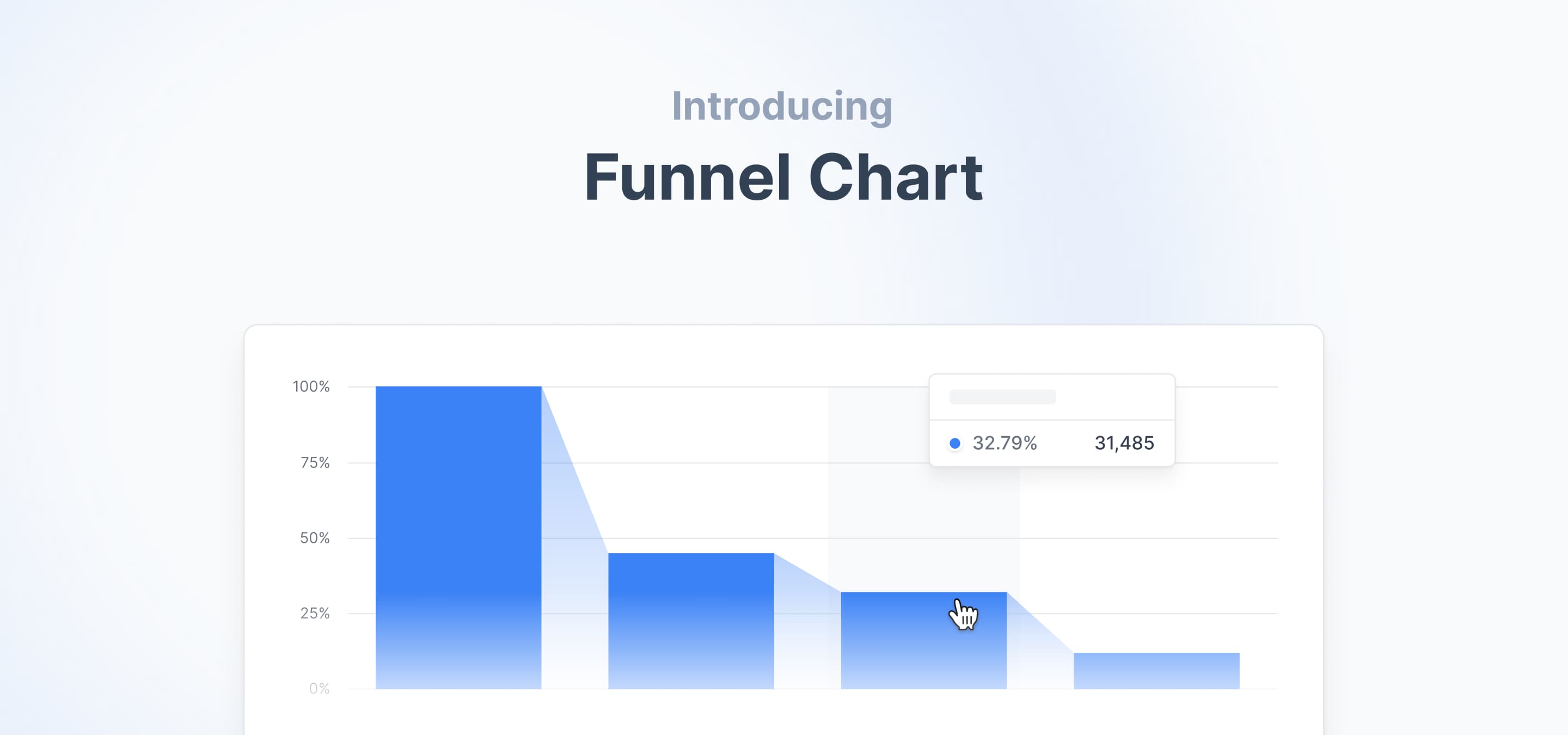
Introducing a new member to the chart family: Funnel Chart.
We’re excited to unveil our latest chart, the FunnelChart! A big thank you to our community hero mbauchet for this stellar contribution.
New Components and Features
- Funnel Chart:
New chart component to display things like: What percent of users converted through my signup funnel within 10 days? At what step of the signup funnel did most users drop off? How has the payment funnel conversion rate in the US changed over time? #1014
Fixes and Improvements
- Internal NoData Component: Improved styles and removed dependencies.
Mar 27, 2024
Overhauled BarList and new prop on BarChart.
This updates adds an overhauled BarList with more styles. We’ve added a new barCategoryGap to customise the BarChart even more. Additionally, we’ve ironed out several bugs and a few added UI refinements.
New Components and Features
- BarChart:
Added barCategoryGap to adjust the gap between two bar categories, which can be a percent value or a fixed value. #1002
- BarList:
Improved Barlist styling when hovered over a bar or anchor. Added a new sortOrder prop. Fixed an propagation issue. #1004
- Textarea:
Added a new autoHeight prop to automatically adjust the height given the input. #798
Thank you amirhesham65 for this useful PR!
Fixes and Improvements
- General: Overhaul of the Tooltip styling. Added a dedicated darkmode style and fixed the text overflow issue. #1001
- TableHeaderCell: Fixed type issue.
- Dialog: Fixed overflow-hidden issue.
- Tabs: Fixed focus ring with keyboard and dark mode color issue.
Feb 10, 2024
New features and bug fixes in Sparkcharts, SearchSelect, and BarList
In our latest update, we’ve added more scale props to the Spark Charts, enhanced SearchSelect with onValueChange, and improved the interactivity of the BarList. Additionally, we’ve ironed out several bugs and a few added UI refinements.
New Components and Features
- SparkAreaChart, SparkLineChart, SparkBarChart:
Added autoMinValue, minValue, maxValue props. #950
Thank you mbauchet for this PR.
- BarList:
Added onValueChange (onValueChange?: (payload: Bar) => void;) prop. #948
Added generic types to the data prop. #957
Thank you mbauchet for this useful PR! Your contributions are immensely appreciated!
- SearchSelect:
Added searchValue and onSearchValueChange props. #944
Thanks to your community member perryraskin for adding this feature.
Fixes and Improvements
- General: Overhaul of the readme.md.
- Housekeeping: Replaced flex-shrink-0 with shrink-0. Removed the double shadow occurence in DateRangePicker.
- Bage, DeltaBadge, Table, List: Improvements of visibility and darkmode appearance.
- Legend: Removed gradients when slider is enabled.
- TextInput, NumberInput: Improved styling when used with password extenstions.
Jan 11, 2024
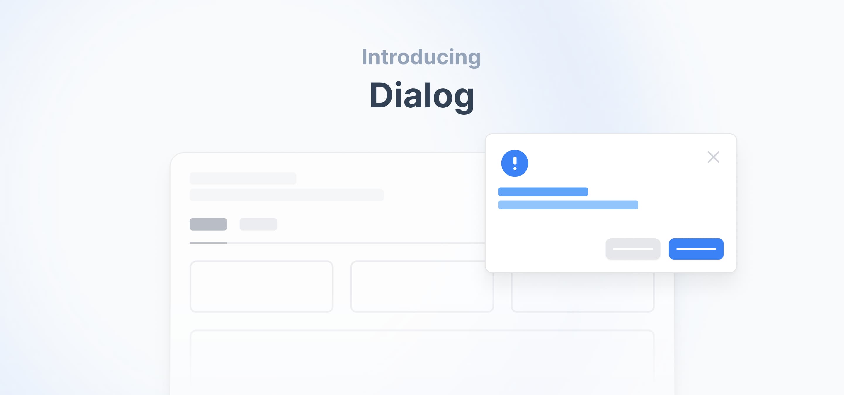
First release of 2024: A new Dialog Component
This release adds a new Dialog component. We also extended the custom colors feature to the Tracker and added a new prop to our charts.
New Components and Features
- Tracker:
Updated color key in thedata prop to accept custom color variants, including HEX (e.g., #4D9CFF) andTailwind colors (e.g., "blue-200"), next to our Tremor base colors (e.g., "blue"). #872
Thank you mbauchet for this PR.
- AreaChart, BarChart, LineChart, ScatterChart:
New tickGap to set the minimum distance between labels on the X-axis. #890
- Dialog:
New Dialog component for enhanced modality. #886
A heartfelt "Thank you" to iamtouha for this great PR.
Fixes and Improvements
- General: Icon overhaul across all components employing the internal icons from the asset folder and replaced the internal tailwind mapping. Added an export for `CustomTooltipProp`
- Dependencies: Updated all Tailwind CSS dependencies to their latest versions.
- Button: Fixed transition error when the `loading` prop is set to `true`.
Thanks to iamtouha for fixing this issue.
- Select, SearchSelect, MultiSelect: Added props for form usage.
This issue was fixed by our awesome community contributors: jzfrank and mbauchet, thank you!
Dec 14, 2023
The feature we have all been waiting for is finally here
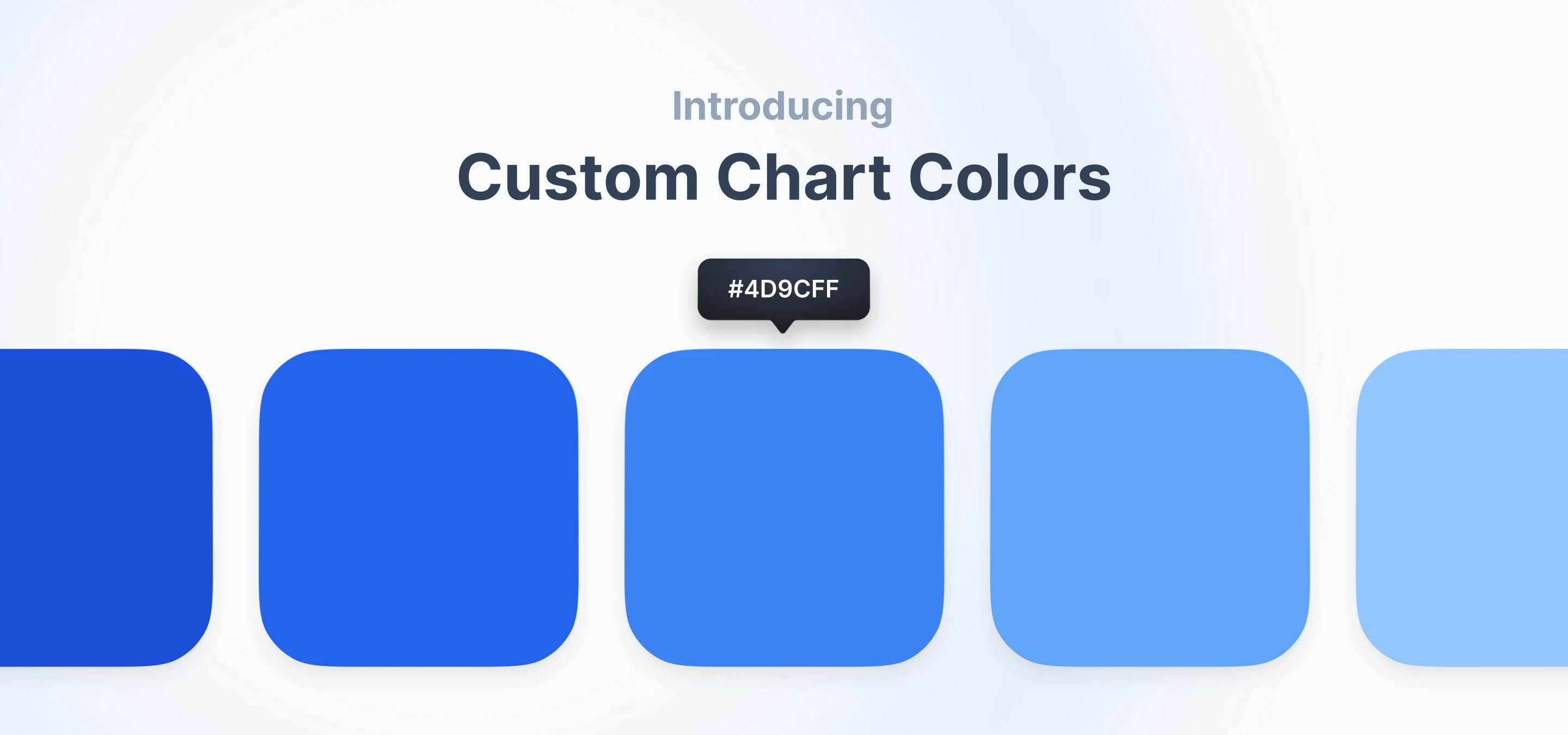
This release tackles the most upvoted GitHub issue in our repository. With custom colors for charts, Tremor helps you now build even better dashboards for customer-facing purposes or anything else that requires to comply to specific branding rules. HEX values and Tailwind colors next to our Tremor base colors can now be used.
New Components and Features
- AreaChart, BarChart, DonutChart, LineChart, ScatterChart, SparkAreaChart, SparkBarChart, SparkLineChart:
colors prop now supports custom color variants, including HEX (e.g. #4D9CFF) and Tailwind colors (e.g. "blue-200"), next to our Tremor base colors (e.g. "blue"). #843
<LineChart  {...props}  colors={[    // now supports any mix of tremor base colors...    'emerald',    'indigo',
    //... tailwind colors    'orange-400',
    // ..., and custom colors    '#32a852',    '#ffcc33',    'my-custom-color-450',  ]}/>
Attention using HEX:For using HEX values, an individual update to the Tailwind theme safelist is required. This ensures that the relevant className for the provided HEX value is generated at build time. See a step-by-step guideline in the doc's theming section.
safelist: [ // .. // custom colors ...['[#32a852]', '[#ffcc33]', ['my-custom-color-450']].flatMap((customColor) => [ `bg-${customColor}`, `border-${customColor}`, `hover:bg-${customColor}`, `hover:border-${customColor}`, `hover:text-${customColor}`, `fill-${customColor}`, `ring-${customColor}`, `stroke-${customColor}`, `text-${customColor}`, `ui-selected:bg-${customColor}`, `ui-selected:border-${customColor}`, `ui-selected:text-${customColor}`, ]), ],A heartfelt "Thank you!" goes out to our incredible contributor adamhenson for crafting this PR.
Fixes and Improvements
- Table: Improvements to internal styling and better forwarding of className. #774
- Switch: Fixed missing tooltip prop. #819, thanks to rajdip-b
- Tracker: Subtle design update. #839
- Table: Root styling with where `className` gets propagated correctly.
- Table: Root styling with where `className` gets propagated correctly. And `tabular-nums` are removed from the default styling
- TextInput: Fixed blur and tab issue when type is set to `password`. Improved the eye icons to be more recognizable.
Nov 6, 2023
Post-Halloween Treats: Enhanced Legend, Rotatable Labels, Textarea & Spark Charts!
Hey there! Halloween is over but we still have some treats for you this week. There is a huge improvement to the legend, labels are now rotatable, new Textarea, spark charts components, and disabled Dates in the Date (Range) Picker. This goes along with a few fixes.
New Components and Features
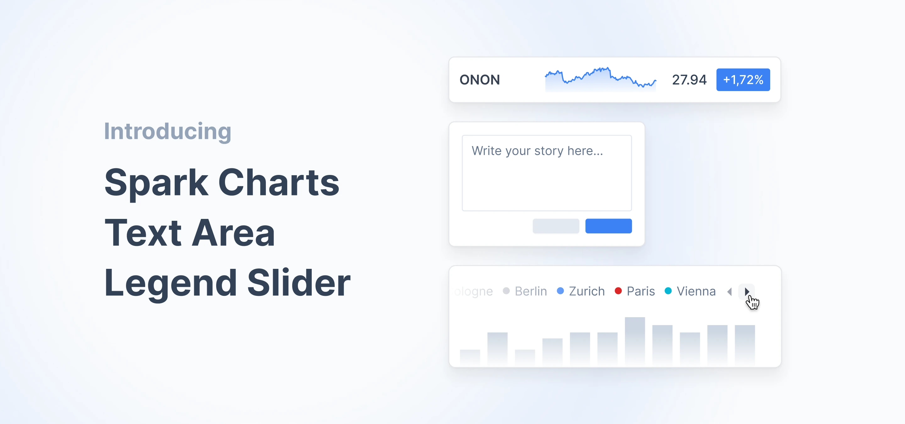
- Textarea: New Textarea component for working with longer bodies of text. #778
- AreaChart, BarChart, LineChart, ScatterChart: New rotateLabelX prop for rotating the labels of the x-axis. Note that the prop takes three arguments: { angle, verticalShift, xAxisHeight }. #775
- AreaChart, BarChart, LineChart, ScatterChart, Legend: New enableLegendSlider prop to use an alternative legend that does not warp the labels, but becomes scrollable once labels wrap.
This feature would not be possible without the awesome mbauchet , thank you! #759 - SparkAreaChart, SparkBarChart, SparkLineChart: New SparkAreaChart, SparkBarChart, SparkLineChart components to use an recused version the normal charts. Great for KPI cards or tables.
Thanks to mbauchet for this great addition! #716 - DatePicker, DateRangePicker: New disabledDates prop, to disable one or more dates.
Fixes and Improvements
- AreaChart, BarChart, LineChart, ScatterChart: Improvements to internal padding and margin when no axes are shown. #774
- Tabs: Improved the solid variants theming. Fixes #751
- Date (range) picker: Added the ability to set disabled date ranges.
- Date(Range)Picker, MultiSelect, SearchSelect, Select: Improved open and close transitions for the dialog menu.
- ProgressCircle: Fixed transition bug when the circle starts from 0.
- NumberInput: Fixed listener invocation bug on clicking +/- button. Fixed step type. Fixes #784
- LineChart, BarChart: Removed gradient prop from types.
- Switch: Changed default color to Tremor’s brand color.
- All Select Components: Fixed issues with Dialog height. Fixed type issue when mapping over `SelectItems`. A big thank you to our community member motinados for solving this complex issue!
Oct 23, 2023
Switching gears in 3.10: The new Switch component is live!
Hey! Exciting week ahead: There is a new <Switch/> component and improvements on the tick display on our charts. This goes along with a few fixes.
New Components and Features
- Switch: New component to toggle between states. #761
A big "thank you" to our awesome community members AlexRousseau92 and mbauchet. - AreaChart, BarChart, LineChart, ScatterChart: New intervalType prop to select between two methods of calculating the ticks and labels: equidistantPreserveStart | preserveStartEnd. With equidistantPreserveStart as the new default.
Fixes and Improvements
- TextInput: Improved input autofill styles on Password-type. And added onValueChange prop. Fixes #751 #736. Thanks to jzfrank.
- MultiSelect: Fixed several dropdown search bugs on MultiSelect. #753
This PR was created by LauraCSDev, thank you! - Date (range) picker: Fix to ring color. #756
Migration Info
- `tailwind.config.js`: We adjusted the border color in dark mode.
Action: Replace DEFAULT: "#1f2937", // gray-900 with DEFAULT: "#374151", // gray-700.
Oct 10, 2023
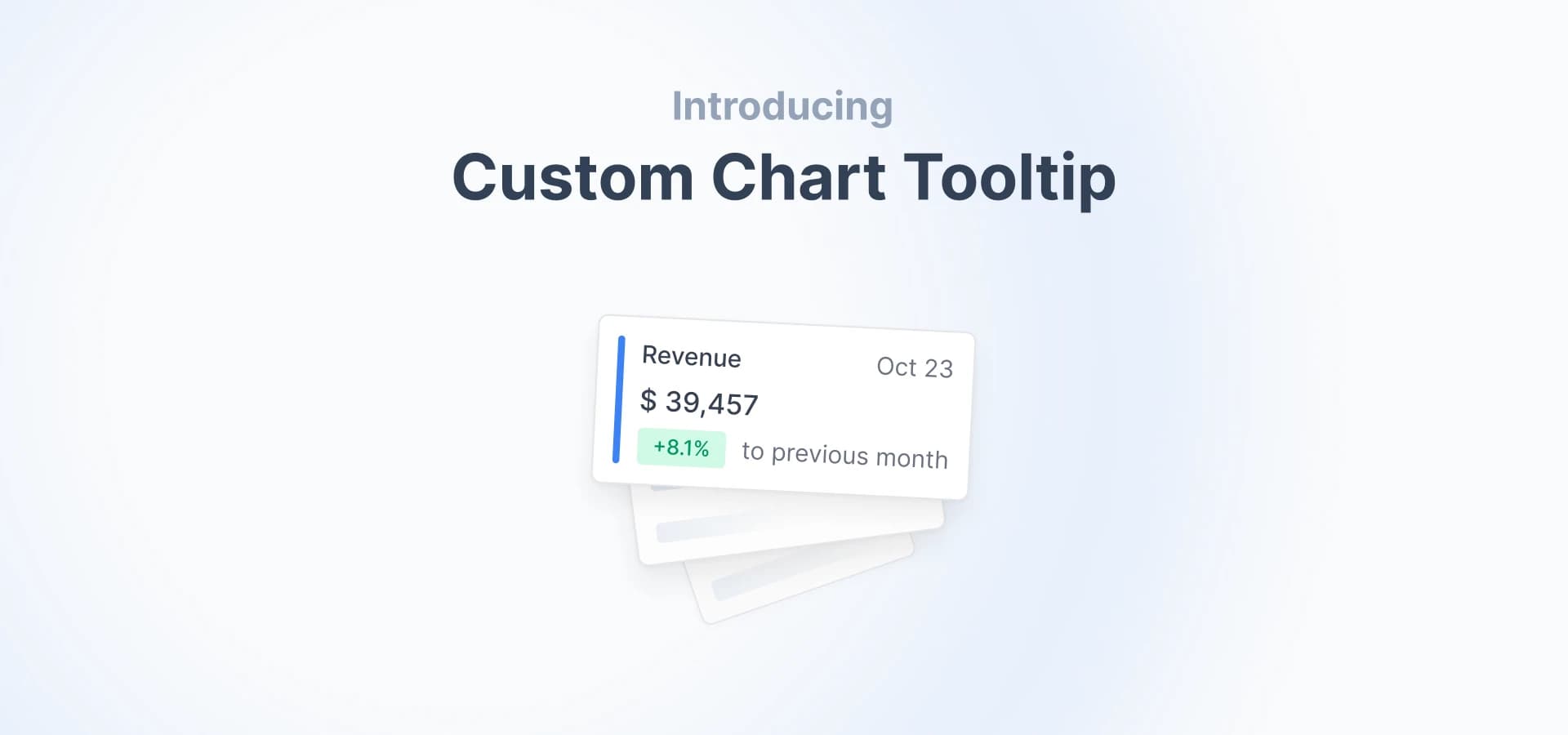
Do more with your data: Announcing custom chart tooltips and a new viz component!
Howdy! Exciting updates to our charts - now with fully customizable tooltips for better analytics. Plus, check out our new component: <ProgressCircle/>.
Once again, our heartfelt thanks go out to our incredible community for crafting PRs, flagging Issues, and contributing code, particularly the MVPs: mbauchet and jzfrank, who were key contributors in this release.
Funny story about mbauchet: In this release, we were unexpectedly greeted by a message from mbauchet, showcasing a screenshot of a bug in our yet-to-be-unveiled documentation. The surprise here? It was available only through a cryptic, unreleased preview link. Ingeniously deducing the URL from another preview link previously shared with our community. That’s what we call passion!
New Components and Features
- AreaChart, BarChart, LineChart, ScatterChart, DonutChart: New customTooltip prop to display a custom Tooltip. Check out the examples here in the documentation. #728
- ProgressCircle: New ProgressCircle component to display progress and other statistics. #703
- SearchSelect: Introduces an enableClear prop to the component, which adds a clear button, facilitating the reset of search. #681
- Divider: New option to use `children`. If something is passed as a child, it gets displayed as a label on top of the divider. #719
- Date (range) picker: New displayFormat prop to customise the format of the displayed date. #589
Fixes and Improvements
- Tooltip: Removed wrong utility for darkmode.
- DateRangePicker: Fixed clear function to also clear the select. #689
- MultiSelect: Disabled browser autocomplete on MultiSelect input #709
- DonutChart: Removed default margin and changed default height to `h-40`. #689
- BadgeDelta: Fixed missing tooltip prop. #732
- TextInput (Password): When type is set to `password` a new button appears, allow to show/hide the password. #615
- Badge, BadgeDelta: Impoved dark mode styles. #722
- BarList: Impoved dark mode styles and updated theme. #723
Sept 25, 2023
Charting a new course: Announcing on click events for more interactivity!
Hello! In the last two weeks, our phenomenal contributors, along with our team, have been working to introduce new feature: Chart Interactivity. This enhancement has been on the wish list of our users for a long time. Additionally, we have given a facelift to some charts and tabs.

New Components and Features
- Area Chart, Line Chart, Bar Chart, Scatter Chart, Donut Chart: New onValueChange prop to activate and make use of click events on all of our charts.
A heartfelt "thank you" to our community MVPs mbauchet and jzfrank for helping us get this feature out there. #702 #696 #673 #672
- Legend: Added new props onClickLegendItem and activeItem.
Fixes and Improvements
- Tab: Improved styling and padding on the `solid` variant. #674
- Area Chart, Line Chart, Bar Chart, Scatter Chart, Donut Chart: Changed default setting: Prop showAnimation is now `false`.
- Area Chart, Line Chart, Bar Chart, Scatter Chart, Donut Chart: Fixed border color bug in dark mode #698
- Area Chart, Line Chart, Bar Chart, Scatter Chart Gridlines are now solid, not dotted. Also, the color changed from `tremor-border` to `tremor-content-subtle`
- Button: Added `cursor-not-allowed` to disabled state.
- ProgressBar: Changed background color from `tremor-brand-faint` to `tremor-brand-muted`
Sept 5, 2023
Better Datepicker and Multiselect
Hello all, this week we’re introducing a new prop to both the date picker and the date range picker. Additionally, we’re enhancing how selected items are displayed in the multiselect component.
New Components and Features
- Date (Range) Picker: New weekStartsOn property to set a desired index for the first day of the week. E.g. 0 = Sunday. #643
- MultiSelect: New display of selected items with the option to clear items individually. #638
Thanks to GitHub user jzfrank for those PRs.
Fixes and Improvements
- Fixes remove scroll utility from css #652
- Fixes toggling on MultiSelect click #655
- Make Grid RSC compliant #639
- Improved MultiSelectSearch with spaces and added new placeholderSearch prop. #651
- Fixes multiselect overflow-x scrollbar on Firefox #669
- Improved conditinal rendering on tabs and added extra Margins in Tab and Button #667
- Adds bold style to Today in Calendar #659
- Fixes NumberInput does not pass event value through onChange issue #649
Jul 29, 2023
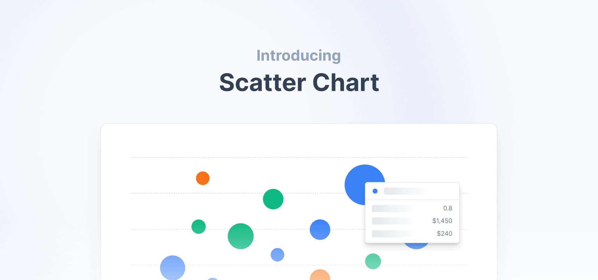
Introducing a new member to the family: Scatter Chart
Hi everyone, we are thrilled to announce the release of our brand new chart: the <ScatterChart/>! This addition opens up exciting possibilities for displaying data. We would like to extend a huge thank you to the GitHub user mbauchet.
New Components and Features
- ScatterChart: New chart component, allows to visualize relationships between two or three variables. #586
- TableFoot, TableFooterCell: Enhancing tables with footer sections for concise data summaries. #595
- DatePicker, DateRangePicker: New enableYearNavigation property adds two navigation buttons to skip through years. Thanks to GitHub user sahiljaidka224 for this PR #513
Fixes and Improvements
- TextInput, NumberInput: Fixed a bug that when error was false, an error message was shown anyways.
Jul 23, 2023
New number input component
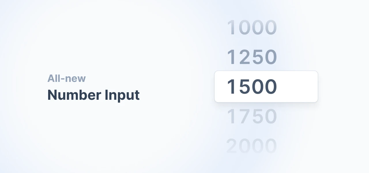
Today, we’re adding <NumberInput> as our new component. We were not really sure about our initial design. This is why we reached out to Twitter for a quick poll. Against our expectations, it felt like we brought together the entire design community on Twitter: We received more than 180 Twitter comments of users telling us how we should style the new component. In the end, Konstantin’s suggestion won the race. It’s always great to see how tiny details can lead to interesting discussions and let us connect to people around the globe with the same dedication to detail.
New Components and Features
- NumberInput: New number input component, allowing numeric data entry with customizable precision and bounds. #519
- AreaChart, LineChart: There is a new curve type `monotone` in the AreaChart and LineChart. #561
- TextInput: Added 3 new types: password, url, email
Jul 3, 2023
New Date Picker component and select improvements
There a new Date Picker component to select a single date. We also merged PRs from our community, improving select components.
Fixes and Improvements
- DatePicker: New DatePicker component which allow for single selecting dates
- Single Select: Adding the functionality to clear state in Single Select component #508
Jun 13, 2023
Fixes to pie chart and datepicker, new Button tooltip
We merged PRs from our community, improving the Button by adding a tooltip. We also improved the themeability of the donut chart’s pie variant. There was also a minor DateRangePicker fix, plus upgrading our charts.
Fixes and Improvements
- DonutChart: The donut chart’s pie variant has now a stroke to separate invidual slices. #506
- Button: Adds tooltip property to the button. #471
- DateRangePicker: Resolved a width issues with truncated text.
Jun 8, 2023
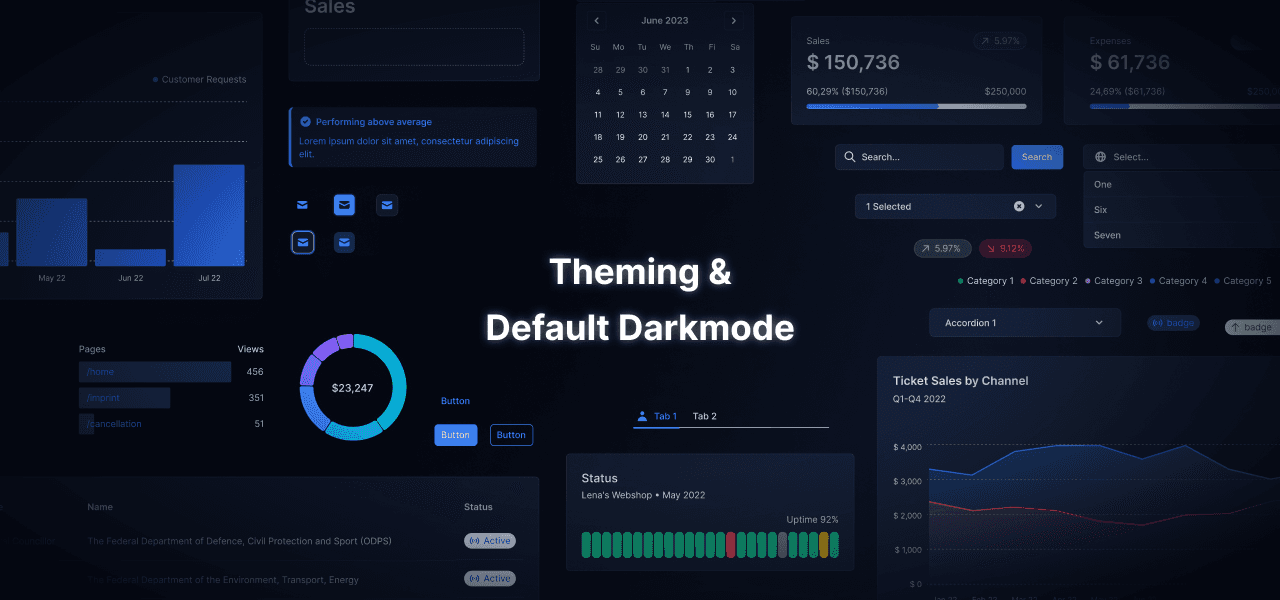
Out of the blue. Introducing: Theming & Darkmode
Hello, Grüezi, Γεια σας. It’s the Tremor team coming to you live from around the globe. We were super busy the last weeks working on our next major release – bringing a bunch of new features people have been asking for a long time. In brief, we are adding:
Comprehensive global theming via tailwind.config.js
An out-of-the-box darkmode
A new tremor CLI helping you setting up projects faster
Important: Docs for V2 can be found here.
Migration Info
- Theming: If you use Tremor in an existing project, you have to add/extend your `tailwind.config.js` with Tremor’s `tailwind.config.js`. See first bullet point below.
- `tailwind.config.js`: Our theming works by extending the tailwind config theme. In order to get the correct styles, please see the tailwind.config.js example in the new Theming page in our docs.
Action: Add Tremor’s theme styles to your `tailwind.config.js` theme section.
Attention: See Theming with Tremor for more.
- Breaking Toggle: This component has been removed. The Tabs component now has two variants: "line" and "solid". The solid variant mimics the look of the Toggle component.
Action: Replace <Toggle> and <ToggleItem> with <TabList variant="solid">. Note that the API for the tabs has changed significantly.
- Breaking Tabs: The Tabs component and its API has been completely redesigned.
Action: Replace <Tab> and <TabItem>, as well as the state logic (index and onIndexChange) with <TabGroup>, <TabList>, <Tab>, <TabPanels>, <TabPanel>. Please refer to the tabs documentation.
- Breaking Dropdown: This component has been removed. Use the new `Select` component.
Action: Replace <Dropdown> and <DropdownItem> with <Select> and <SelectItem> Note that the API for Select has changed.
- Breaking DateRangePicker: API changed significantly.The value prop uses Object instead of Array. The select options now use children.
Action: Replace the value array with the object.
Action: Replace enableDropdown with enableSelect.
Action: Replace dropdownPlaceholder with selectPlaceholder.
- Breaking Select, SearchSelect, MultiSelectBox: The type of the value property has been changed to string. MultiSelectBox has been renamed to MultiSelect. Prop text has been replaced with a children property.
Action: Cast the input for value to string
- Breaking Grid: Properties with numCol have been renamed.
Action: Replace <Grid numColsSm={2}> with <Grid numItemsSm={2}>
- Breaking ProgressBar: Properties have been renamed.
Action: Replace percentageValue with value
- Breaking MarkerBar: Properties have been renamed.
Action: Replace percentageValue with markerValue
- Breaking DeltaBar: Properties have been renamed.
Action: Replace percentageValue with value
- Breaking CategoryBar: Properties have been renamed.
Action: Replace percentageValue with value
Action: Replace categoryPercentageValues with values
- Breaking RangeBar: Has been removed. Use the MarkerBar with it’s new minValue and maxValue props.
Action: Replace RangeBar with <MarkerBar minValue={XX} maxValue={XX}>